
How to Design a Direct Mail Piece
When it comes to creating a great direct mail piece, design plays a crucial role. But direct mail design involves more than just the colors and imagery on your piece. An effective design guides your prospects through your advertisement and drives home your marketing message in a visually appealing way. Great design also adheres to your brand standards and helps you create a cohesive brand image that’s easily recognizable.
In this guide, we’ll review the most important steps in creating a great mail piece: planning, designing, and proofing. Whether you’re creating your own piece or working with a company that’s designing it for you, you’ll find valuable direct mail design tips to improve your ads. Let’s get started.
Plan Out Your Direct Mail Piece
Planning out your direct mail piece ahead of time will help you streamline the design process by keeping you organized. Plus, if you encounter any problems down the road, you can revisit your initial strategy to get back on track. Follow the steps below to develop your plan.
Know Your Target Audience
It’s nearly impossible to design an effective direct mail piece if you don’t know who you’re targeting. Understanding what your audience wants helps you create a persuasive design that complements the copy you write. You’ll want to know things like how much information your prospects need, what offers they will respond to, and what kind of images will resonate with them before delving into the rest of the design process.
Identify the Goal of Your Piece
Another important step in planning your direct mail piece is identifying the goal or intent behind it. Why are you creating your advertisement in the first place? What are you hoping to achieve in terms of results?
Knowing the goal of your piece (and your campaign as a whole) helps you hone in on the message you want to send and informs your decisions about copy, imagery, and format. Speaking of which…
Choose the Right Format
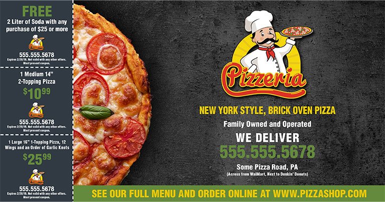
With your audience and goal in mind, it’s now time to choose which direct mail format you’ll use. By format, we mean the type of mail piece you’re sending – menus, postcards, brochures, etc. Format is important because it dictates the amount of copy and images you can fit onto your piece. If your goal is to provide plenty of detail about your products or services, a larger piece like a brochure might be the best choice. On the other hand, if you just want to announce a sale or provide a few coupons, a postcard is probably your best bet.
It’s also important to consider the effect you want to have on prospects when they open the mailbox. In most cases, the larger the piece, the larger the impact. For example, using a large postcard to announce a sale is more likely to grab your prospects’ attention than a small flyer. However, keep in mind that the larger you go, the higher the price.


For more information on direct mail formats and which is best for your needs, check out our article, What Is Direct Mail Marketing?.
Organize Copy Effectively
There are several key copy elements that usually appear on every direct mail piece. These include but are not limited to:
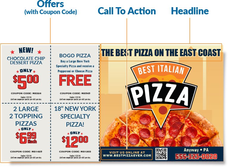

While there are no hard and fast rules for placing these copy elements, there are some basic principles to keep in mind. First, your headline should always be in a prominent place and in a larger typeface than your subheadings and supporting copy. Additionally, your offer and CTA need to stand out clearly since they’re the most important parts of your mail piece. Adhere to these simple guidelines, and you’ll ace one of the most important parts of direct mail design.
For help writing these key components, check out our companion piece on how to write direct mail copy that sells.
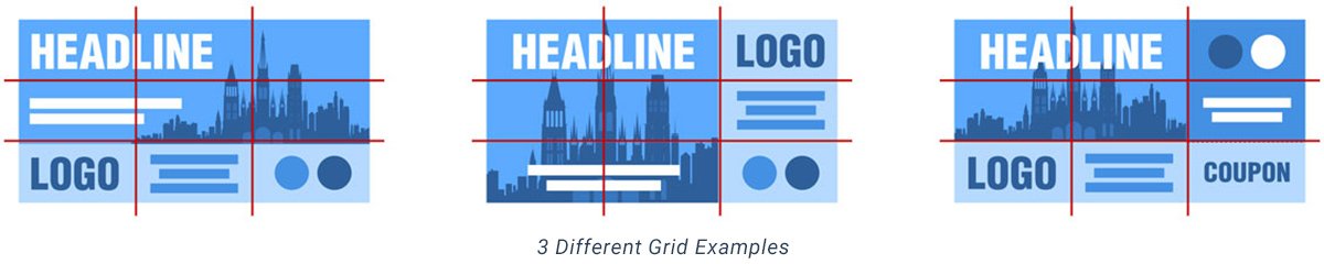
Develop a Grid Layout for Your Piece
The final step in planning out your mail piece is creating a grid layout. The term “grid layout” comes from the traditional use of graph paper to help line up your design elements. While using graph paper is no longer common, the term is still used today.
Copy elements should be laid out in plain text, showing placement and size relative to how it will be designed once planning is completed. Use image placeholders (dummy images), and don’t worry about choosing your background at this stage in the process. You can spend more time fine-tuning your image and color selection later.
Planning your piece ahead of time using a grid layout helps you establish flow throughout your advertisement. Plus, it allows you to identify problem spots on your piece that might trip audiences up as they read. Start with three variations so you have some options and narrow down to your final layout from there.
Design Your Direct Mail Piece
After you’ve finished planning out your direct mail piece, you’re ready to start designing. Keep the following in mind as you work on your ad.
Be Strategic with Fonts
The font you choose for your mail piece also plays a significant role in how readers perceive your ad. Keep the following in mind as you format the text:
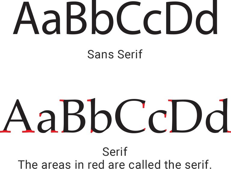
Stick to one or two typefaces. While it’s tempting to use flashy fonts on your direct mail piece, your best bet is to use one or two typefaces that are easily scannable. Keep in mind that your prospects are quickly flipping through their mail and don’t want to decipher a jumbled mess of fonts.
Make sure it’s easy to read. In most cases, you’ll want to select a sans serif font (Arial) for your ads. Sans serif fonts don’t have small accents at the end of each letter stroke like serif fonts (Times New Roman), so they look uniform and simple. This makes them easier for readers to scan and quickly comprehend.
Vary font size to add visual interest. Try using several different points (also known as weights or sizes) of the same font to jazz things up. Just remember to base your choice of font size on the importance of each copy component (i.e. put the headline in the largest font size).
Utilize White Space
Incorporating white space is another important aspect of effective direct mail design. Simply put, white space is the empty area between the different elements of your design (such as your logo and your CTA). Keep in mind that white space refers to the blank area on your piece, not an actual color. White space plays an important role in emphasizing the most important parts of your piece, while also keeping your ad from being cluttered and overcrowded.
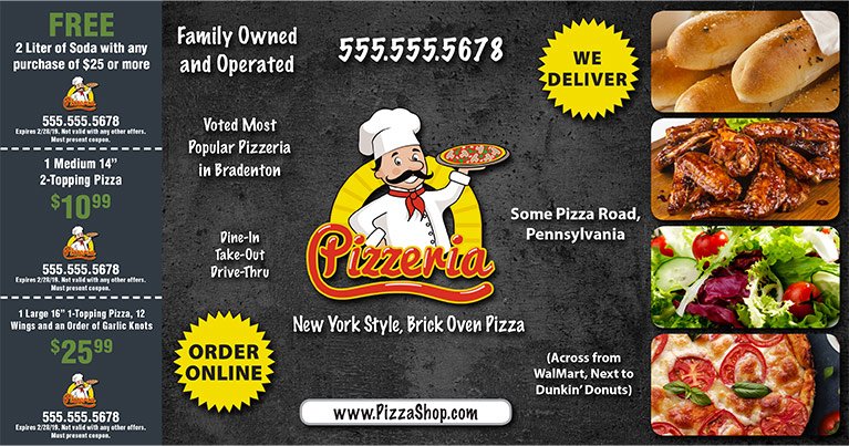
Use Imagery Wisely
When it comes to making your direct mail piece memorable, imagery is one of your most powerful allies. Carefully chosen graphics get people’s attention and increase the likelihood of them reading your piece.
Always use as much lifestyle imagery as possible on your direct mail pieces. Pictures of people using your product or service the way you want them to helps prospects understand how your offerings will enhance their lives. Don’t just show readers what your product or service looks like – illustrate for them exactly how they’ll benefit from it.
Here are a few more tips for using imagery effectively in your direct mail:
Use high-resolution images. A high-resolution image shows a lot of detail. Technically, it should be 300 dpi (dots per inch) in your image editor to print at this recommended quality. This makes your pieces look crisp and professional. On the other hand, low-resolution images are often blurry and look unprofessional.


Avoid backgrounds that are busy. The background is the area or scenery behind the text and other design elements of your piece. A background can be an image, color, or pattern. One that’s too complicated can distract prospects from your message – the main object you want them contemplating.
Don’t put text on top of images. The text on your ad can become hard to read if it’s overlapping an image. If you’re using an image as a background, try stamping out part of the image and replacing it with a solid color to make the text stand out. Or, manipulate the text so it’s on a less busy part of the image.

Proof Your Direct Mail Design
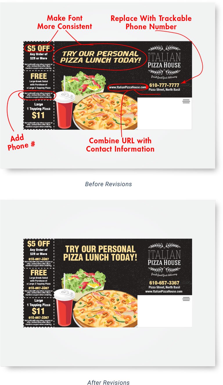
Careful editing is the final step in designing a great direct mail piece. To make sure your ad is as effective as possible, proof it yourself and then have others look at it as well.
Proof the Piece Yourself
Start by proofing your ad yourself to catch obvious mistakes in your copy, like misspellings or grammatical errors. You’ll also want to pay attention to whether or not your images clash with one another. Finally, make sure you haven’t strayed too far from the original goal of your piece and that your messaging is consistent throughout. Taking time to reflect on the finished product always helps you produce a stronger advertisement.
Ask yourself the following questions as you proof your direct mail piece:
- Does the overall design of your ad flow and make sense?
- Are there any places where the copy is unclear or confusing?
- What’s the main point you’re trying to emphasize on your piece? Is it coming across clearly?
Additionally, you should always be sure to proof the tracking information on your piece. Verify your tracking phone numbers, QR codes, and marketing links are working and going to their intended destinations. To learn more, check out our guide on how to track direct mail.
Have Others Proof Your Design
Ask your employees, coworkers, friends, and family members to evaluate your ad and provide candid feedback. You can even share your piece with customers who visit your shop to get their impressions.
Getting the opinions of impartial third parties helps you create more effective mail pieces. And the extra sets of eyes can catch mistakes you may have overlooked since you’ve seen your ad repeatedly during the planning, design, and proofing processes.
Ask others who proof your piece the following questions:
- What is your main takeaway from the piece? Make sure it matches your intended goal from the planning stage.
- Is the ad visually appealing?
- Is there anything on the piece that’s difficult to understand?
Conclusion
It’s important to remember there’s no such thing as a “perfect” design, so your goal should always be continuous improvement. One of the best ways to improve your work is to test several different designs against one another and compare the results. Keep in mind that all testing should stay closely married to your brand to help you build brand recognition with your audience.
Creating a cohesive brand and using great design helps you present your marketing message in a consistent, logical, and visually appealing way. Ultimately, your design joins the important elements of your direct mail ad together to create a unified piece prospects will engage with and respond to.