With all the competition for consumers’ attention, the thought of producing an effective ad campaign of your own can feel next to impossible.
Maybe it’s time to consider a strategy that puts your message straight into the hands of the consumers you want to reach: direct mail marketing.
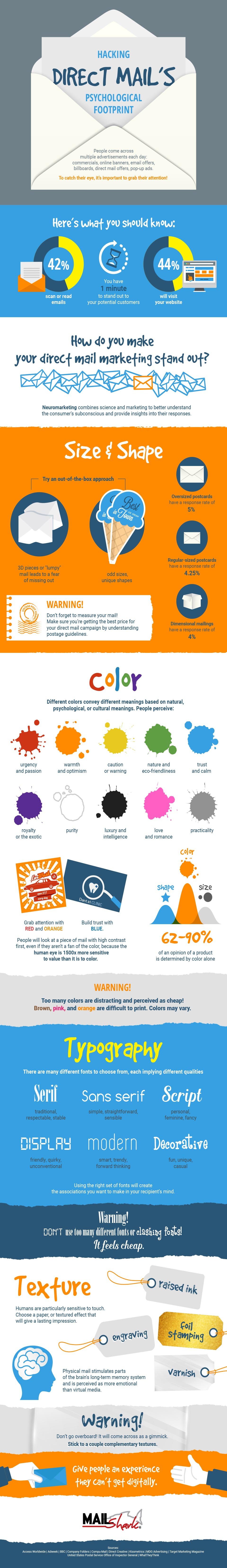
Unlike bulk media advertising, which has no particular target audience and is largely ignored by those it does reach, direct mail ads are personalized, tangible and pretty darn hard to miss.
When done right, applying marketing psychological principles to direct mail campaigns can be extremely effective, and help you stand out in the mailbox. These tips will help give you your edge.
Choose the Right Colors
One of the most important things to know about creating any advertisement is this: viewers skim. If you want your audience to actually dig in and read your ad, you have to first catch their eye, and color is the #1 most effective tool at your disposal.
Over the years, the field of color psychology has revealed a lot about how color affects the human brain. But no matter how much you learn about general color associations, it’s important to remember these three things:
- There are always exceptions based on individual experiences.
- Different cultures have different color associations.
- Color associations evolve. Green didn’t always mean “eco-friendly,” but is sure does now!
So, before you pick your colors, do a little research. And, when in doubt, don’t hesitate to enlist the help of a professional graphic designer.
Make Your Font Work for You
Like every aspect of ad design, the type of font you use should depend on what you’re trying to convey. Many amateur ad designers will try to find the weirdest font they can in the hope of catching their viewers’ eye, but the truth is that’s seldom effective.
It’s not that you can’t use “fun” fonts — it’s that you have to use them deliberately and appropriately.
Otherwise, you may wind up being the next Daniel Gilbert, who to this day is still mocked for an angry rant he wrote nearly seven years ago. The rant itself may have been well-founded — the team he owns had just lost the legendary LeBron James. But it was written in one of the most notoriously silly fonts known to typography — Comic Sans.
Don’t be a Daniel Gilbert. Decide what kind of mood you want your ad to create, then choose fonts that convey that mood.
Find the Balance Between Unique and Professional
If document design isn’t your forte, the best thing you can do for your direct mail campaign is to enlist the help of a graphic designer or even a graphic design student at the local university. If you’re determined to take on the challenge yourself, though, here are a few key dos and don’ts:
Do:
- Experiment with uncommon shapes, sizes and textures of stationary.
- Make use of contrast in your designs. You can really catch someone’s eye by using complementary colors or two extremely different styles of font in one ad.
- Display your text in an organized, easy-to-read manner.
- Choose a tone that matches the goals of your ad and conveys your business the way you want it to be conveyed.
Don’t:
- Use too many uncommon design qualities in one place. The ad will look too busy.
- Go overboard with contrasting design elements. Using more than one or two will make your ad look amateurish.
- Choose text that’s difficult to read, or display text at unreadable sizes or angles on the page.
- Resort to over-the-top, “look at me!” tactics. “DO YOU NEED NEW TIRES? WE HAVE THEM!” comes across as yelling at the reader.
A word of caution: “Unique” is not synonymous with “anything out of the ordinary will do.”
For instance, if you’re advertising your lawn care service, it’s both misleading and ineffective to slap down a giant picture of a monster truck. Monster truck enthusiasts will resent the false advertisement, and people who need a new lawn care service will dismiss the seemingly irrelevant ad before reading it. Lose-lose.
Learn From Other Ads
Start looking at the advertisements you see. Which ones catch your eye? Which ones annoy you? Which ones would you have never noticed if you hadn’t been keeping an eye out for them?
Take note of the colors, designs, fonts and overall advertising tactics that seem to work and seem to flop. What did you learn? If there’s a better way to apply marketing psychology principles to that piece of mail, you have an idea for your next campaign. Fortunately, these principles can combine in multiple ways. Mix it up. Give people an experience they can’t get digitally.